An SEO consultant website that leads with results.
A full website redesign for Adrijana Palatinuš Perić, a senior SEO consultant. The old site looked dated: a photo slider, thin all-caps text over busy images and nothing that showed her results. I rebuilt the whole site in 2 weeks and did all of it myself: strategy, copy, design, development, SEO and analytics.

Drag to compare before and after
The problem
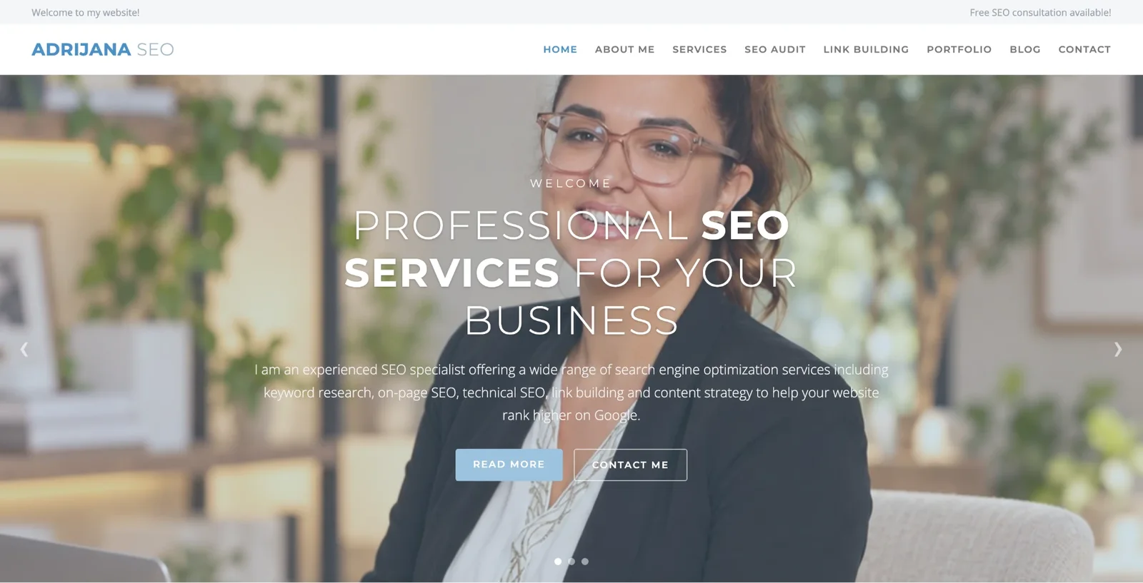
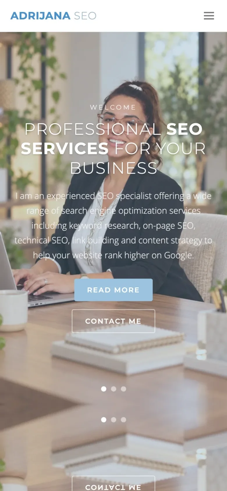
The site looked dated and said nothing specific. The first screen was a three-slide photo slider with “Welcome” and “Professional SEO services for your business” in thin all-caps letters, followed by a list of every SEO service.
The contrast was poor. Thin white text sat on top of a busy photo, and the pale blue “Read more” button was easy to miss. A top bar said “Welcome to my website!” and the menu had eight all-caps items.
Nothing was connected and nothing proved her skill. Strong results from years of SEO work were nowhere on the page, so she looked like every other freelancer.
What I redesigned
Every change, element by element: how it was, what I changed, and why.
Headline
“Professional SEO services for your business” in thin all caps.
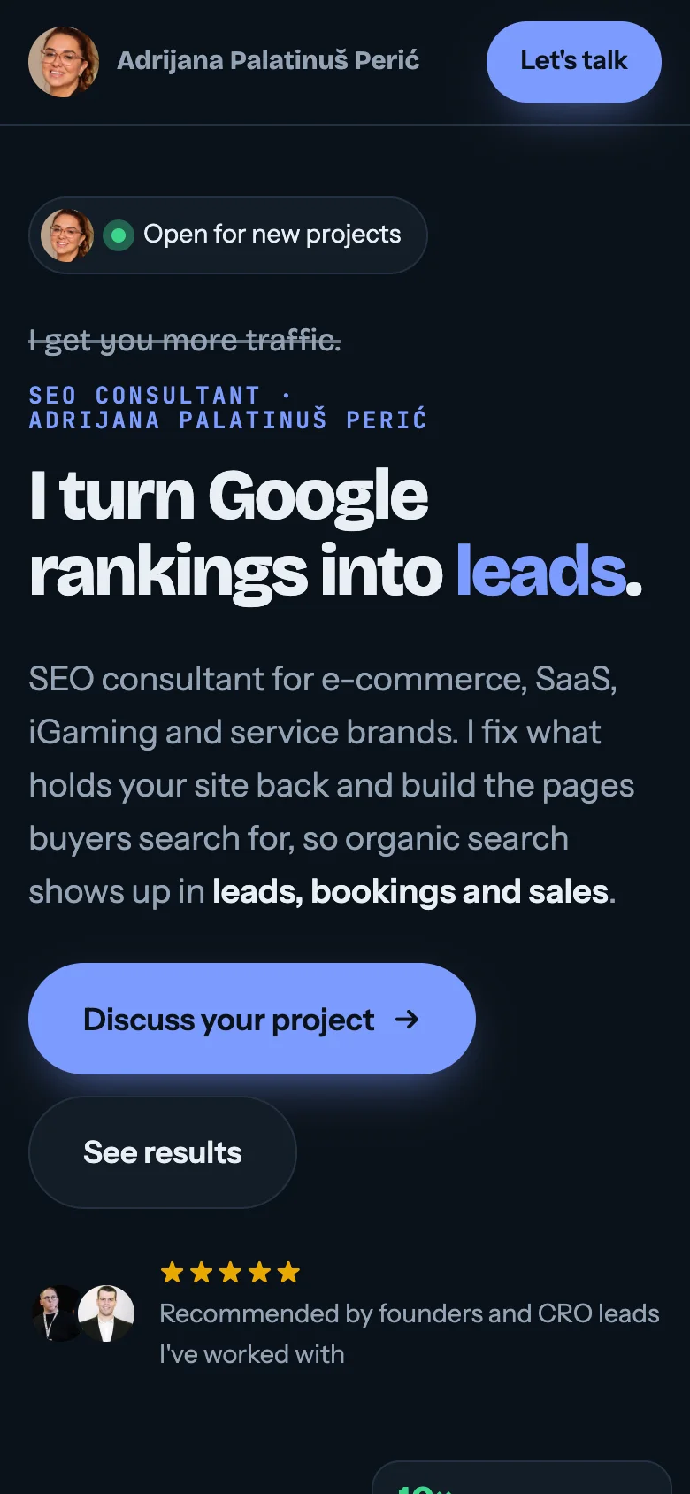
“I turn Google rankings into bookings.” with a crossed-out “I get you more traffic.” above it, and the last word changing between leads, sales, bookings and revenue.
Why: It says what makes her different in one line: she sells business results, not traffic.
Proof on the first screen
A photo slider.
An animated search result where her site ranks first, with real results next to it: 10× organic traffic for an EV app, +1,900% traffic from AI assistants, +324% app installs from search.
Why: Visitors see proof before they read a single paragraph.
Results
No results anywhere.
A results band and seven SEO case studies, each with the period, the start and end numbers and where the numbers come from, filterable by type.
Why: Specific, checkable numbers are what makes a consultant credible.
Contrast and type
Thin white text over a busy photo and pale blue buttons.
A dark, high-contrast design with bold type and one bright blue main button.
Why: Easy to read on any screen, and the next step is always obvious.
Navigation and story
A welcome bar and eight all-caps menu items.
Six menu items that follow the page: Results, Services, Process, About, Blog and FAQ, plus one “Let’s talk” button.
Why: The page tells one story, from promise to proof to how working together goes.
Trust
No reviews, no background.
Recommendations from founders and CRO leads, a short about section with her career timeline and a 4-step process from the intro call to reporting.
Why: People hire a person. Showing who she is and how she works removes the risk.
Before and after on mobile
Most visitors arrive on their phone. Drag the slider to compare the two versions.
Drag to compare before and after
More of the new site
A few sections further down the page.
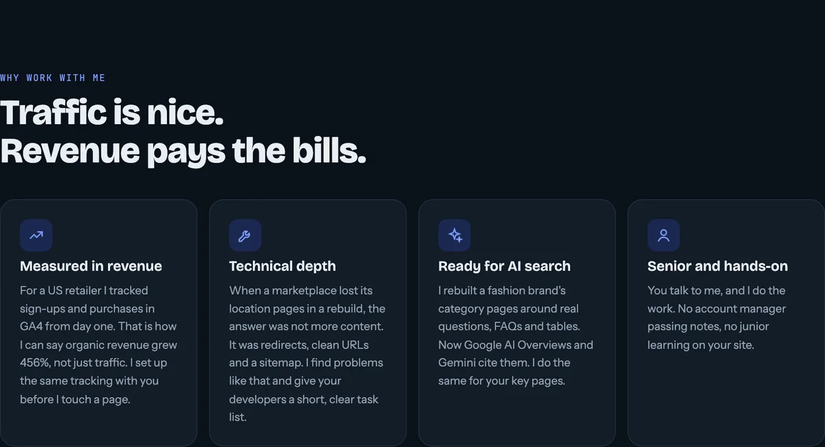
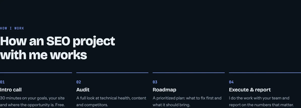
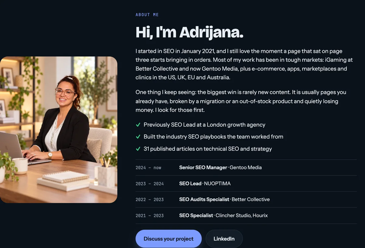
How I built it
I did the whole project myself in 2 weeks: positioning, copy, design, development, SEO and analytics. I built the site with Claude Code and keep it in GitHub, so new case studies and blog posts go live in minutes.
Since the client sells SEO, the site had to be clean under the hood too: fast pages, proper titles and descriptions, structured data, a sitemap and a blog built to rank and to be cited by AI assistants.
George started with a detailed analysis of my old site before touching a single pixel. Within days he came back with a clear idea of what to change and why, and the new site nailed it. It finally looks like the work I actually do. Thank you for bringing the site to life. I’d highly recommend George for any CRO or website project!
Let’s talk
Let’s make your next test a winner.
Tell me about your funnel. I’ll point out quick wins, tell you what I’d test first, and say honestly whether I’m the right fit.