
A solar ad and landing page that start the quote in one tap.
A paid traffic project for a local solar installer. Their “free solar quote” page, where every quote button pointed, showed “Something went wrong” where the survey should be, so paid clicks had no way to convert except a phone call. I designed a new Meta ad and a landing page that continues it, with a 4-step quiz that starts in the hero, and tested ad to old page against ad to new page.

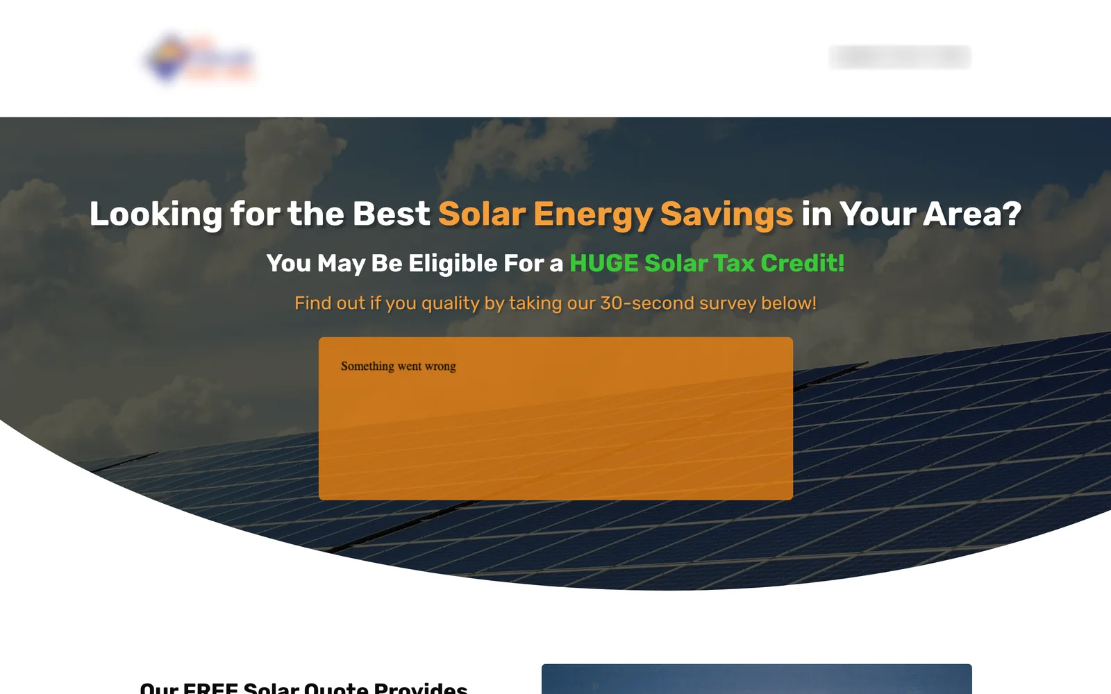
Drag to compare before and after
The problem
The lead form was broken. The quote page that all “Get a free solar quote” buttons pointed to showed only “Something went wrong” where the 30-second survey should be, on desktop and on mobile. Every paid click landed on a page with no way to convert except the phone number.
The main promise was out of date. Both the homepage and the quote page led with a “HUGE Solar Tax Credit”, but the federal residential credit ended for systems installed after 2025, which makes it inaccurate and risky ad copy.
Smaller trust issues added up: a typo in the subhead (“find out if you quality”), a browser tab title naming a different company, the same reviewer name on two testimonials with different cities, a “save up to 75%” claim with nothing behind it, and the full site menu on a page meant for ad traffic.
What I redesigned
Every change, element by element: how it was, what I changed, and why.
The ad
No recent ads to continue.
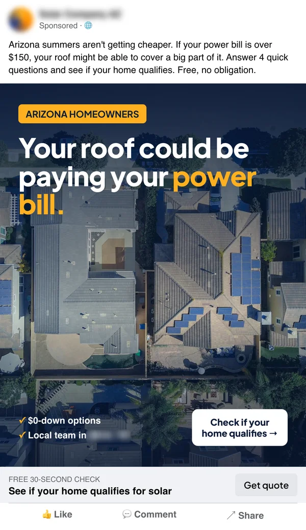
A Meta feed ad built on a promise that doesn’t depend on the tax credit: rising power bills and $0-down options. Headline: “Your roof could be paying your power bill.” A clear qualifier for local homeowners and the button “Check if your home qualifies.”
Why: The ad filters the right people in and makes one promise the page can keep.
Message match
A generic quote page with an outdated tax credit headline.
The same headline, photo, homeowner label and call to action as the ad.
Why: Visitors know in a second that they landed in the right place.
Quiz in the hero
A survey that didn’t load.
The quiz starts on the first screen with a one-tap question: “Do you own your home?”
Why: The first step is the easiest possible action, and it’s right where people look first.
4 steps, contact details last
One form asking for everything at once (when it worked).
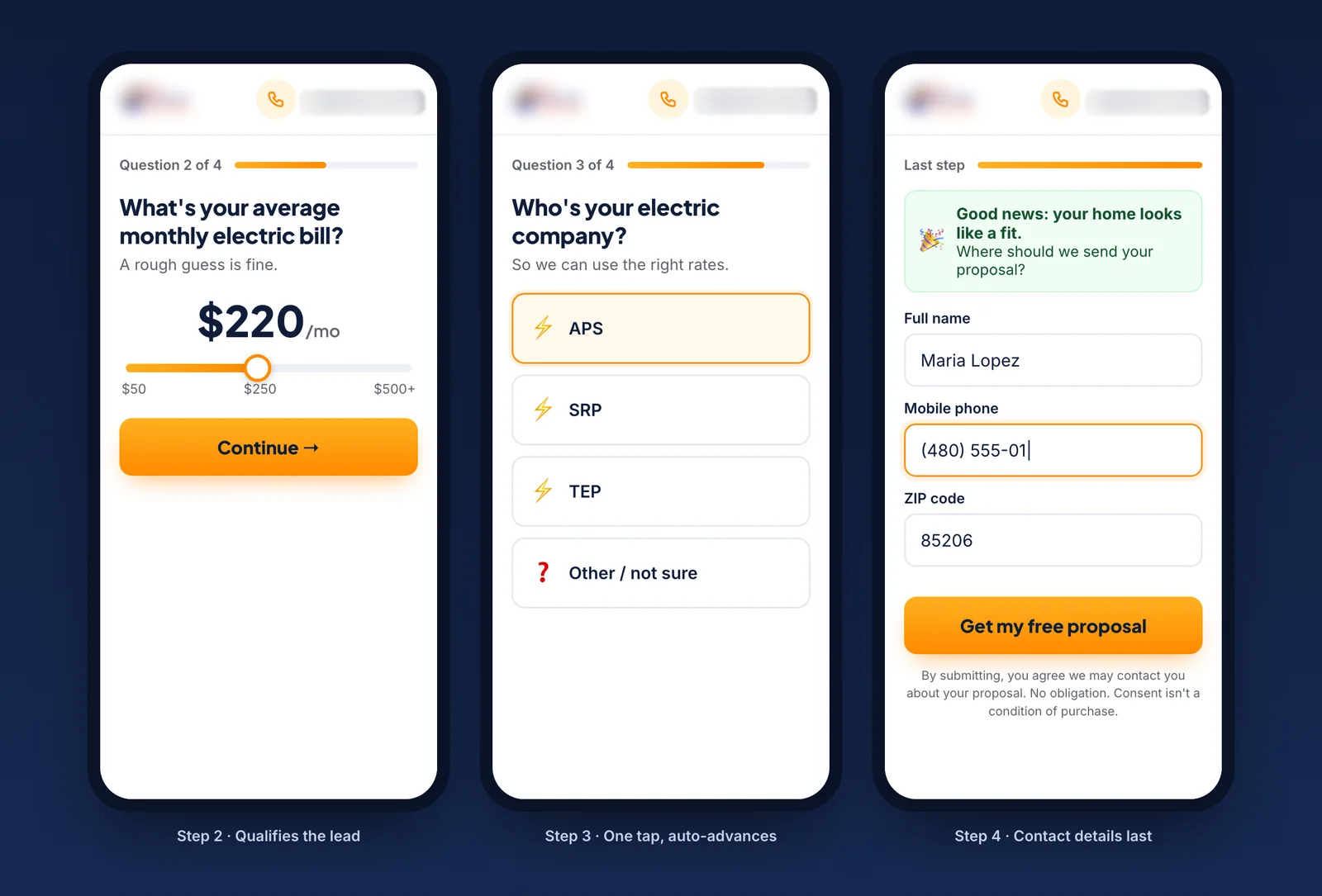
Own or rent, monthly bill on a slider, electric company in one tap, then name, mobile and ZIP with clear consent text.
Why: Easy questions build momentum. By the contact step, people have already invested time.
Trust strip
Claims without proof and a mixed-up testimonial.
Facts from their own site only: a local office, 25-year panel and 10-year workmanship warranty, $0-down options and a 1 to 2 day install.
Why: Specific, checkable facts beat big percentages.
Focus
The full site menu on the quote page.
No menu, one goal, the phone number kept visible for people who’d rather call, and a 3-step “what happens next” to remove the fear of a pushy sales call.
Why: Ad traffic gets one job to do and a clear picture of what follows.
Before and after on mobile
Most visitors shop on their phone. Drag the slider to compare the two versions.
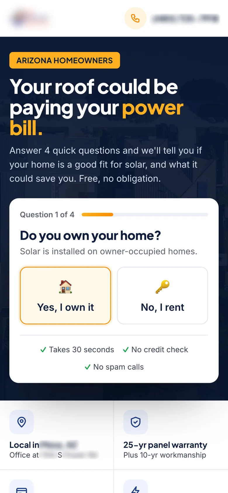
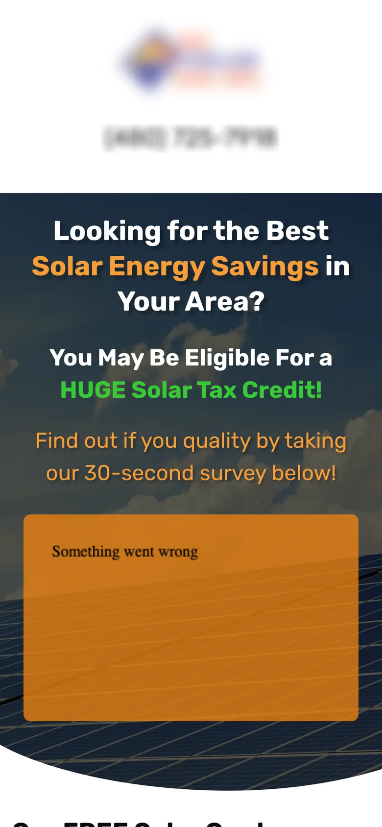
Drag to compare before and after
The ad and the quiz
The Meta ad the landing page continues, and quiz steps 2 to 4 on a phone: monthly bill, electric company and contact details.
How I measure it
Tested as a paid landing page A/B test: the same ad traffic split between the old quote page and the new landing page.
The primary metric is landing page conversion rate, from visitor to submitted lead. Cost per lead is the business outcome, quiz start rate and step-by-step drop-off are the early signals, and lead quality (homeowners with a qualifying bill, and booked appointments) is the guardrail.
More on the metric: how to calculate revenue per visitor.
Let’s talk
Let’s make your next test a winner.
Tell me about your funnel. I’ll point out quick wins, tell you what I’d test first, and say honestly whether I’m the right fit.