
A salon profit calculator website that shows the product at work.
A full website redesign for Salon Profit Lab, a pricing and profit calculator for salon and spa owners. The old site looked dated, the contrast was weak and nothing on the page connected. I rebuilt the whole site in 3 weeks and did all of it myself: strategy, copy, design, development, SEO and analytics.

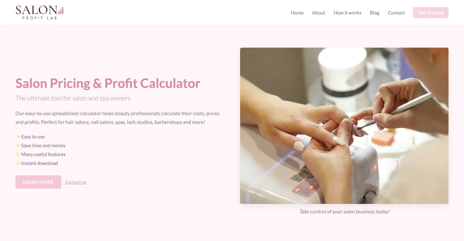
Drag to compare before and after
The problem
The site looked old and didn’t tell a story. The first screen was the product name as a headline, “The ultimate tool for salon and spa owners”, a paragraph about a spreadsheet calculator and four emoji bullets: easy to use, save time and money, many useful features, instant download. None of it said what a salon owner actually gets.
The contrast was weak. Pale pink text and a pale pink “Learn more” button sat on a pink background, so the one action on the page was the hardest thing to see.
The product was never shown. The right half of the screen was a stock photo of a manicure, there was no price, and the sections below didn’t connect to each other or lead anywhere.
What I redesigned
Every change, element by element: how it was, what I changed, and why.
Headline
The product name, “Salon Pricing & Profit Calculator”, with a generic line under it.
“Know what every treatment really earns you.” with one line on the pain: busy every day, but not sure where the money goes.
Why: Owners don’t want a calculator. They want to know which treatments make money.
Product in the hero
A stock photo of a manicure.
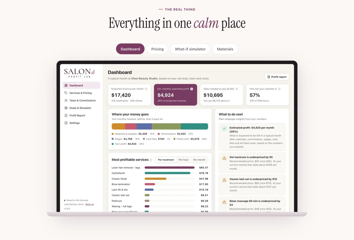
A live example dashboard: monthly revenue, profit, the sales needed to pay the bills, how full the calendar is, and plain tips like “Gel manicure is $5 too cheap”.
Why: Showing the answer the product gives sells it faster than any feature list.
Offer and buttons
A pale “Learn more” button and a “Contact us” link. No price.
The launch price up front as a one-time payment, one strong “Get it” button and “Try the free demo” for people who want to look first.
Why: One path for buyers who are ready and one for people who need to try it.
Contrast and type
Pale pink headings and buttons on a pink background.
Deep plum text, a serif headline with one word in italics and a warm coral button that stands out.
Why: Readable text and an obvious button. The page still feels like a beauty brand.
Story
Separate sections that didn’t connect.
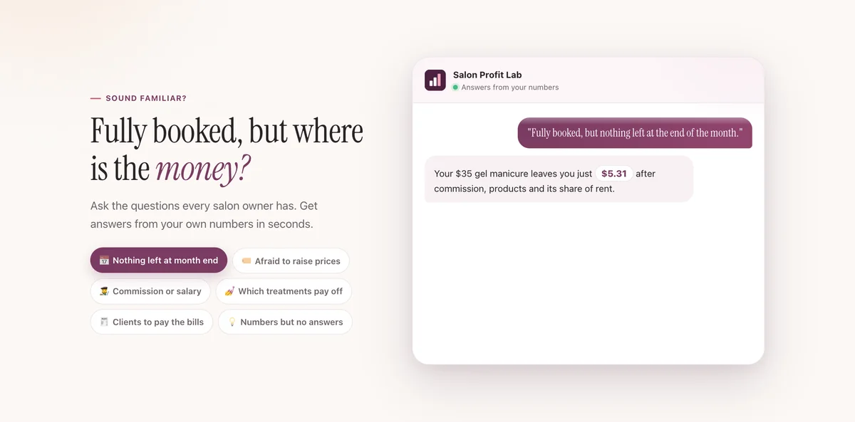
One flow: the owner’s question (“Fully booked, but where is the money?”), the numbers for one treatment step by step, a first answer in one minute, a product tour, who it’s for, pricing, guides and FAQ.
Why: Each section answers the question the previous one raises, so the page reads top to bottom.
Objections
“Instant download” and nothing else.
Pay once and keep it, no subscription, works offline, data stays private, plus a 14-day money-back guarantee next to the price.
Why: The usual reasons not to buy are answered before anyone has to ask.
Before and after on mobile
Most visitors arrive on their phone. Drag the slider to compare the two versions.
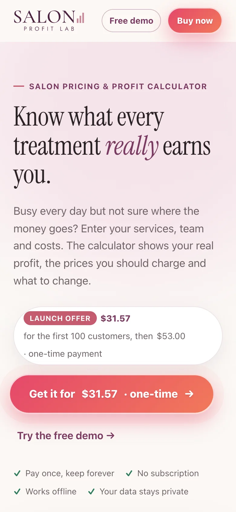
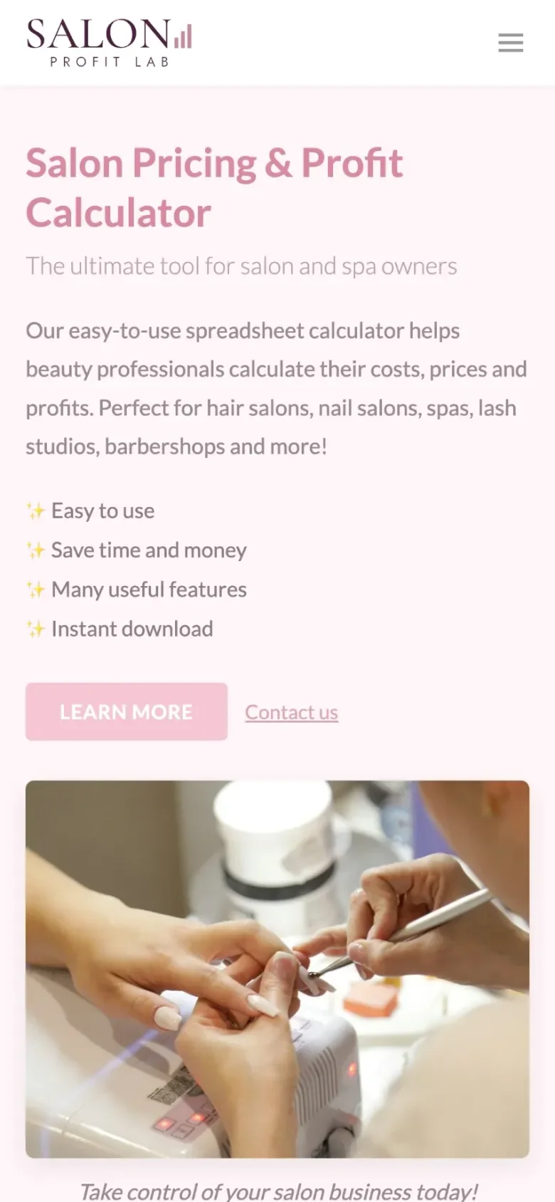
Drag to compare before and after
More of the new site
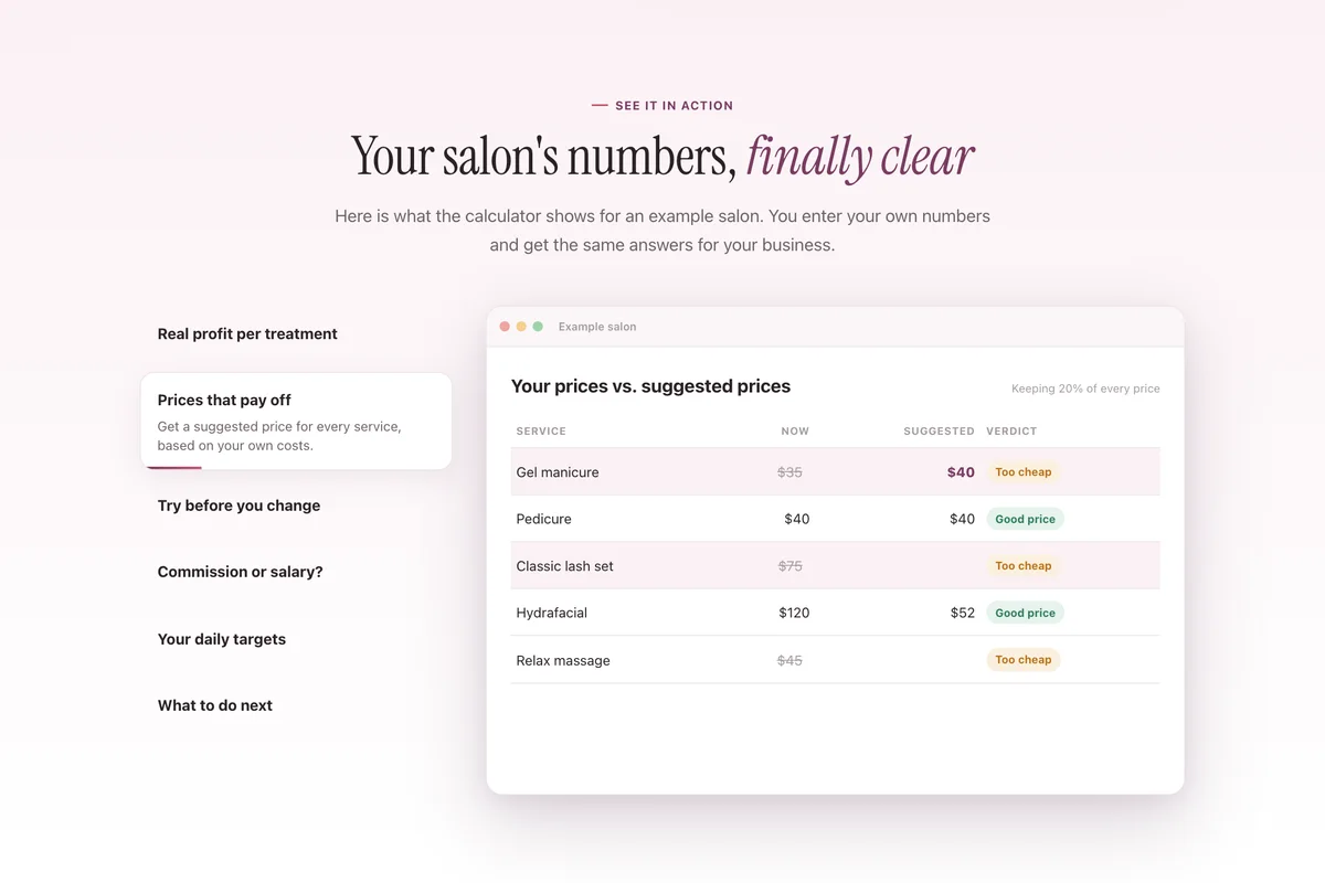
A few sections further down the page.
How I built it
I did the whole project myself in 3 weeks: positioning, copy, design, development, SEO and analytics. I built the site with Claude Code and keep it in GitHub, so changes go live in minutes.
For search I set up clean page titles and descriptions, a sitemap and a Guides section around what salon owners actually search for. For analytics I added Google Analytics and the Meta pixel behind a consent banner, so the client can see which pages and ads bring buyers.
I came to George with a site that explained the product but didn’t sell it. He dug into the details first, walked me through his idea quickly and clearly, and delivered a site that’s spot-on. Salon owners now see exactly what they get before they scroll. Thanks for bringing it to life.
Let’s talk
Let’s make your next test a winner.
Tell me about your funnel. I’ll point out quick wins, tell you what I’d test first, and say honestly whether I’m the right fit.