
A candle homepage that answers “will I smell it?”
A homepage redesign for a family-owned brand of hand-poured soy candles. Visitors had to scroll past a hero, a promo strip, a long testimonial and a benefits section before they saw a single candle, a price or an “Add to bag” button. I rebuilt the top of the homepage around the question candle buyers actually have: will I smell it when it’s lit?

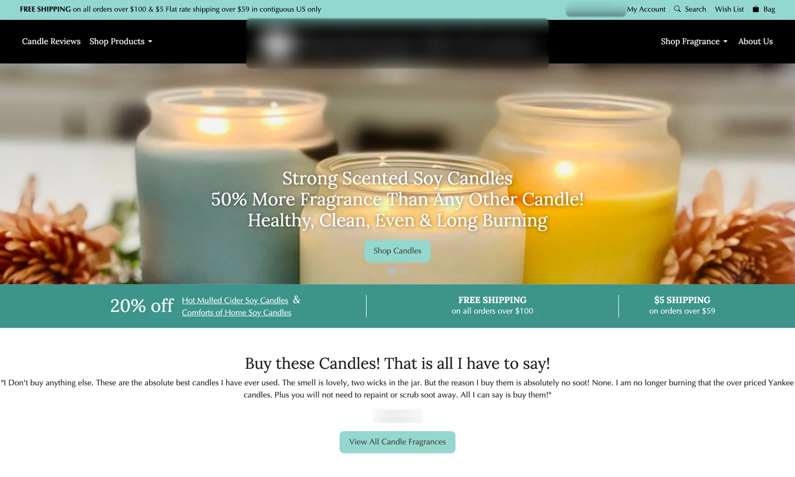
Drag to compare before and after
The problem
No products on the first screens. On desktop and on mobile, a visitor scrolled past the hero, a promo strip, a long testimonial and three benefits without seeing a candle, a price or a button to buy.
The hero was hard to read: three lines of centered claims over a busy photo and a small pale “Shop Candles” button. On mobile, the text wrapped into seven lines over the image. Shipping rules were repeated in three different wordings in the top bar, the promo strip and the footer.
The look didn’t match the price. Mint buttons, centered body text and generic headings didn’t feel like a $19.99 hand-poured candle.
Their best tool was buried. Every scent has a strength rating, from Light to Wow, which is exactly what candle buyers worry about. It was only reachable through a dropdown menu.
What I redesigned
Every change, element by element: how it was, what I changed, and why.
Headline
Three centered claims over a busy photo: strong scented, 50% more fragrance, healthy and clean.
“Candles you can smell from the next room.” with one line of facts: 100% soy, double wick, 75 to 85 hour burn, phthalate-free.
Why: It speaks to the number one complaint: candles that smell great in the jar but not when lit.
Product facts
Spread across a benefits section further down.
Four short chips under the headline: double wick, 75 to 85 hour burn, phthalate-free and lead-free cotton wicks, plus a “16oz jar candle, from $19.99” card on the photo.
Why: The facts that justify the price sit next to the promise.
Calls to action
One small, pale “Shop Candles” button.
“Shop fall bestsellers” as the main button and “Find your scent strength” as the second.
Why: One path for people ready to buy, one for people who don’t know what to pick yet.
Scent strength
Only in a dropdown menu.
A five-step scale right under the hero, from Light to Wow, with the room each level fits best, from bedrooms to open floor plans.
Why: It turns the biggest worry, “will I smell it?”, into an easy choice.
Products
No candles on the first screens.
Four seasonal bestsellers with price, a strength badge and “Add to bag”, within the first scroll on desktop.
Why: People can start shopping without leaving the homepage.
Shipping as a bundle nudge
Three different wordings of the shipping rules.
Said once: 3 candles unlock $5 shipping, 6 unlock free shipping.
Why: At $19.99 a candle, that nudges orders from one or two candles to three or six.
Proof
A long testimonial further down the page.
A real customer review under the buttons, cut to the line that proves the promise: “It even travels upstairs into my kids’ rooms.”
Why: One sentence that confirms the headline does more than a paragraph nobody reads.
Look and mobile layout
Mint buttons, centered text, and seven lines of text over a photo on phones.
A warm cream, brown and amber palette with an arched photo frame. On phones: headline and promise first, then the photo with the product card, full-width buttons, the strength scale in one row and bestsellers in two columns.
Why: The page now looks like a boutique candle brand, and every key element fits the phone screen.
Before and after on mobile
Most visitors shop on their phone. Drag the slider to compare the two versions.
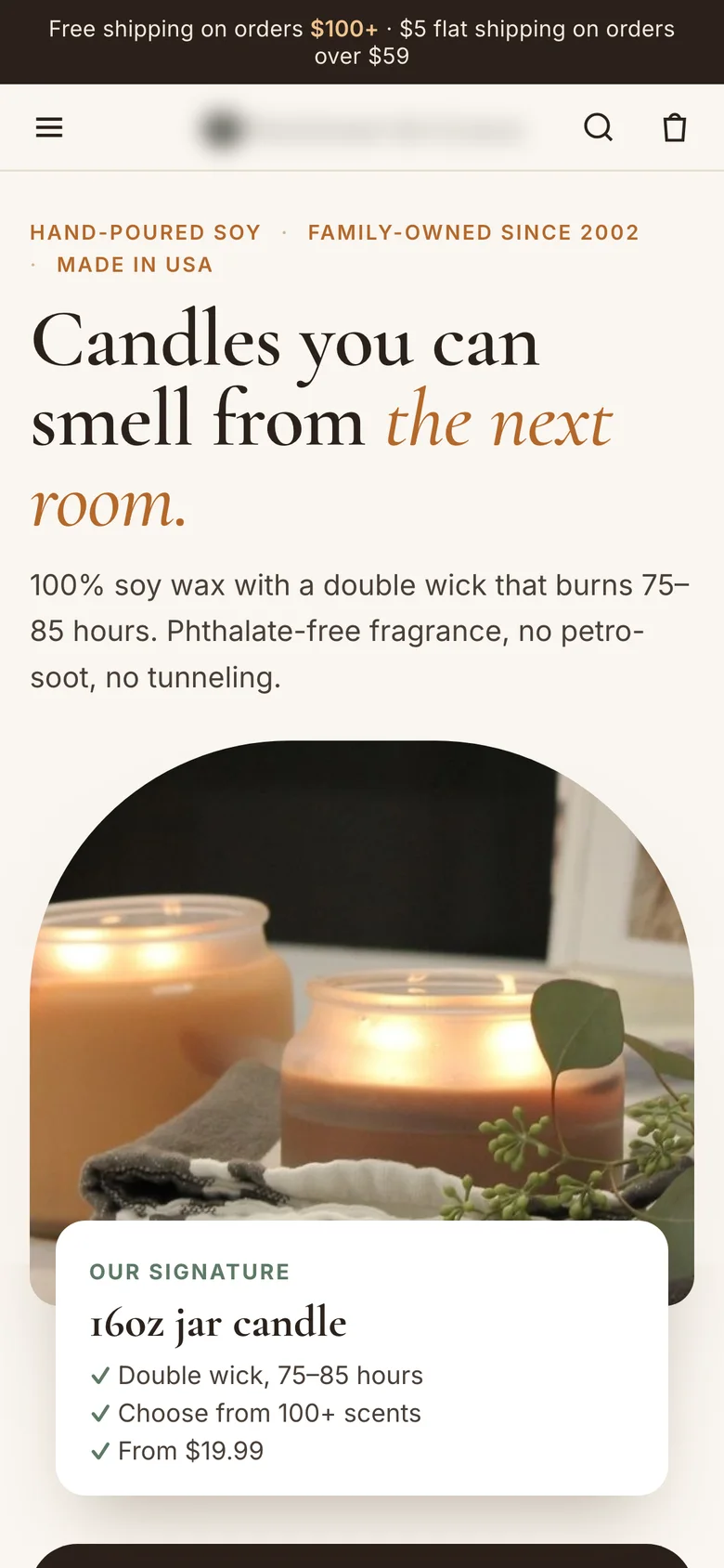
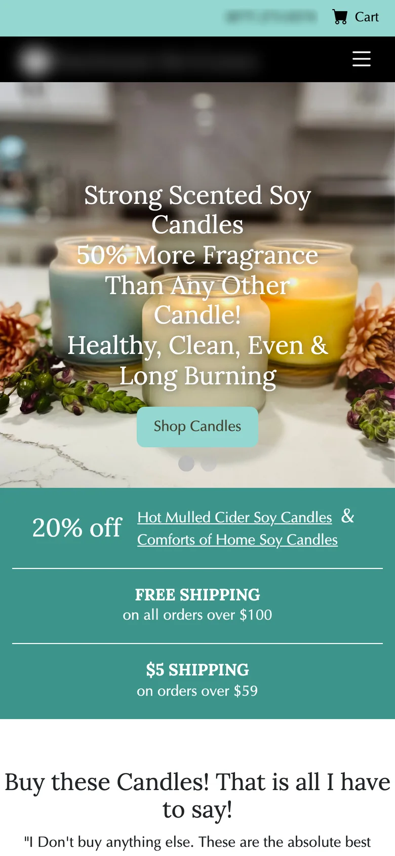
Drag to compare before and after
How I measure it
Tested as a homepage A/B test with a 50/50 traffic split for 4 weeks. The primary metric is revenue per visitor, because the redesign targets both conversion and order size.
I also watch conversion rate, average order value and items per order, since the shipping nudge is built to move orders to 3 or 6 candles, plus homepage click-through to products and add-to-bag rate. Bounce rate and return rate are the guardrails.
More on the metric: how to calculate revenue per visitor.
Results
The redesign ran as an A/B test against the old homepage for 4 weeks, with homepage traffic split 50/50. The new homepage won on the primary metric. Revenue per visitor went up and fewer people bounced on the first screen.
Let’s talk
Let’s make your next test a winner.
Tell me about your funnel. I’ll point out quick wins, tell you what I’d test first, and say honestly whether I’m the right fit.