
From a kitchen video to a homepage that sells the taste.
A homepage redesign for a family-run hot sauce brand making small-batch sauces since 2011. The old homepage opened with a video of the kitchen and an all-caps headline. The real reason to buy, sauces made from fresh peppers instead of vinegar, was buried further down the page. I redesigned the homepage on desktop and mobile to lead with the taste, the products and the proof.

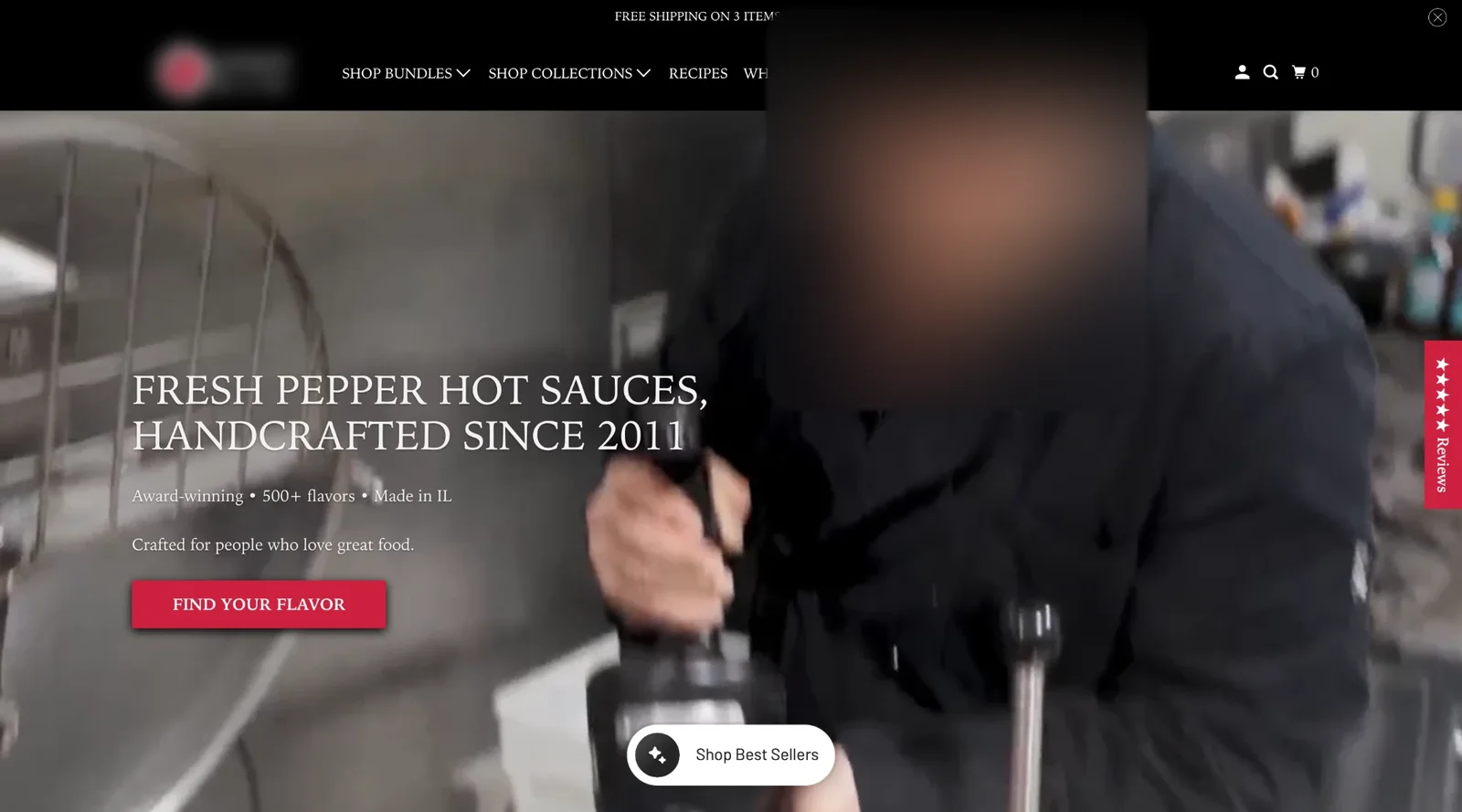
Drag to compare before and after
The problem
The first screen was a looping kitchen video with a headline on top. It showed craft, but not the product. On mobile the text sat on a busy video and was hard to read.
The strongest selling point, that the sauces are made from fresh peppers and aren’t vinegar-heavy, only appeared much lower, under a logo and a few paragraphs.
Reviews were a half-hidden carousel, and the brand’s monthly subscription wasn’t visible at all on the homepage.
What I redesigned
Every change, element by element: how it was, what I changed, and why.
Headline
“Fresh pepper hot sauces, handcrafted since 2011” in all caps over a video.
“Hot sauce that tastes like fresh peppers, not just heat.” with a short line about the family and the six year-round favorites.
Why: The headline now says what is different about the taste. That is what makes someone choose this sauce over the one in the supermarket.
Hero visual
A kitchen video with people at work.
The six bottles in a row, with a short review next to them.
Why: The video told a story, but the bottles sell. Showing the range also tells people there are several flavors to choose from.
Proof
A review carousel below the first screen, with cards cut off at the edges.
“4.9 from 964 reviews” above the headline and one short five-star quote next to the products.
Why: Ratings work best before people read the pitch, not after they scroll past it.
Subscription
No mention of the monthly club on the homepage.
A “Hot Sauce of the Month” card and “Join the Sauce Club” as the second button.
Why: A subscription is worth far more than one order. Giving it a visible place on the first screen lets fans opt in from day one.
Buttons
One “Find your flavor” button and a floating “Shop best sellers” pill.
“Shop the favorites” as the main button and “Join the Sauce Club” next to it.
Why: Two clear paths, one for first-time buyers and one for fans, instead of two buttons that compete.
Facts and navigation
“Award-winning • 500+ flavors • Made in IL” in small text, and a menu with dropdowns plus Wholesale.
A clean facts row (since 2011, 500+ flavors created, new sauces every month) and a simple menu: Shop Sauces, Sauce Club, Bundles, Recipes, Our Story.
Why: Big, simple facts are easier to trust and remember, and the menu now puts the club right next to the shop.
Before and after on mobile
Most visitors shop on their phone. Drag the slider to compare the two versions.

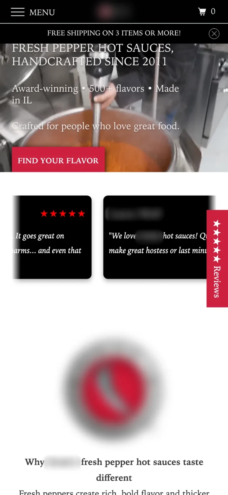
Drag to compare before and after
How I measure it
Tested as a hero A/B test against the old homepage. The primary metric is revenue per visitor, with Sauce Club sign-ups and bounce rate watched alongside it.
More on the metric: how to calculate revenue per visitor.
Let’s talk
Let’s make your next test a winner.
Tell me about your funnel. I’ll point out quick wins, tell you what I’d test first, and say honestly whether I’m the right fit.