
A Detroit hot sauce homepage that finally shows the sauces.
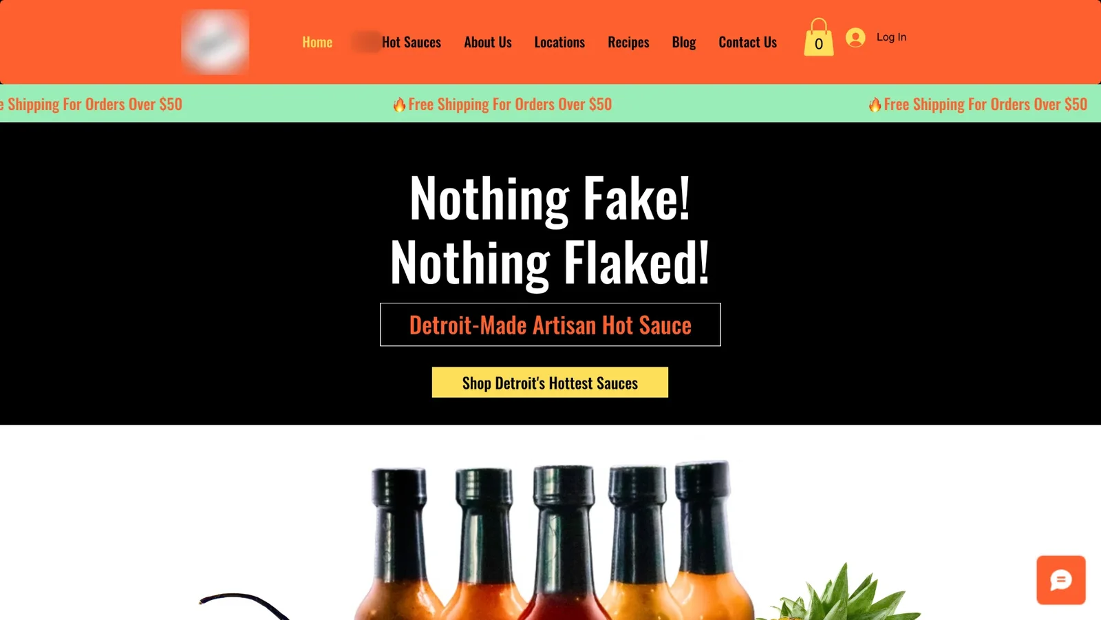
A homepage redesign for a small-batch hot sauce brand from Detroit. The old homepage had a strong line, “Nothing Fake! Nothing Flaked!”, but the first screen was text on black with a loud header. The bottles only appeared further down, and there was no price, no flavors and no reason to buy more than one. I kept the brand voice and redesigned the homepage on desktop and mobile around the products.

Drag to compare before and after
The problem
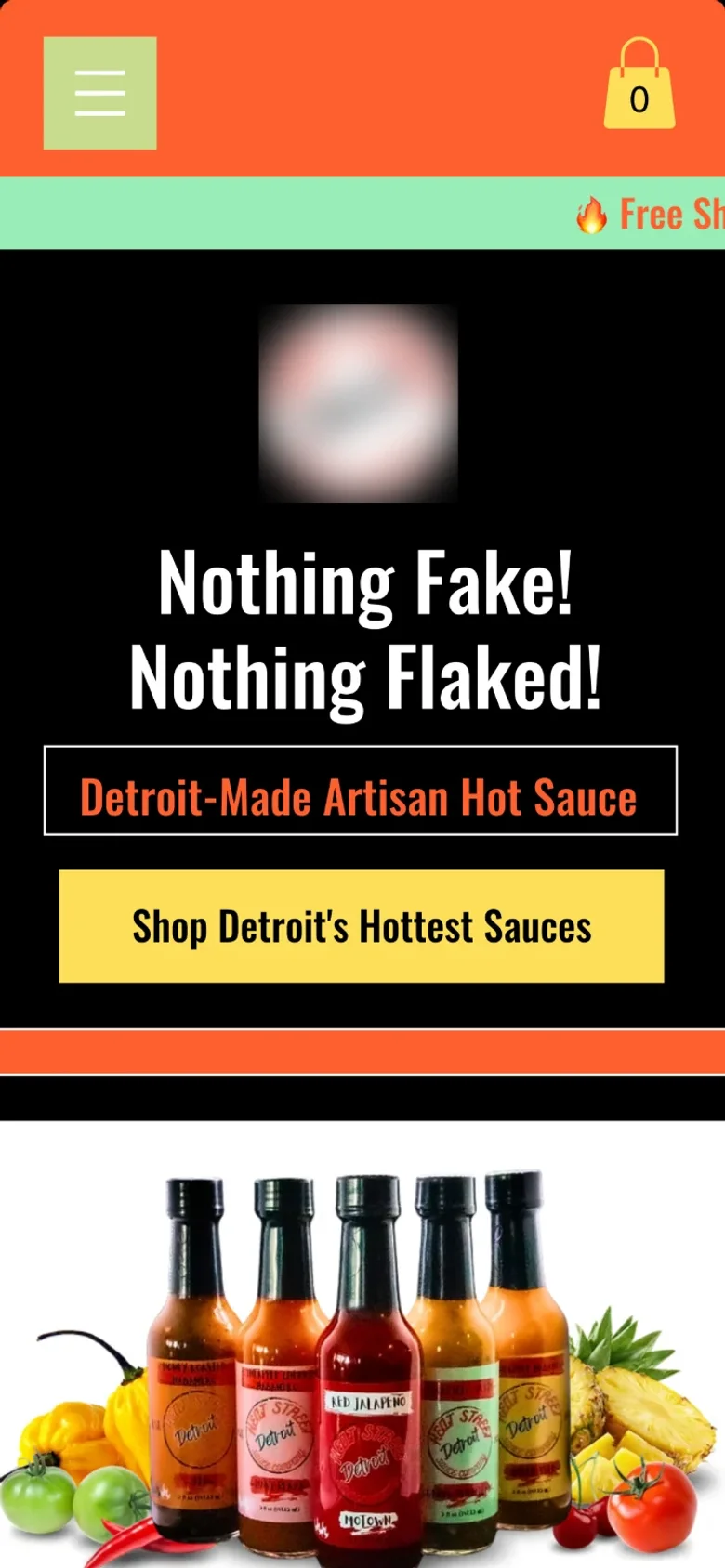
The brand had personality and a great line, but the homepage didn’t sell. On desktop the first screen was centered text on black with the bottles cut off below it. On mobile, people saw a header, a logo and the slogan before any product.
There was nothing to choose from on the first screen: no flavors, no price, and one generic button. The only offer, free shipping over $50, ran as a scrolling banner without telling people how close they were.
The loud orange header, the green banner and the chat button all competed with the slogan, so nothing on the page clearly led the eye.
What I redesigned
Every change, element by element: how it was, what I changed, and why.
Headline
“Nothing Fake! Nothing Flaked!” with “Detroit-Made Artisan Hot Sauce” in a box below.
The same line kept as the headline, with “Small batch · Made in Detroit” above it and one sentence on what makes the sauces different: fresh ingredients, small batches, no shortcuts.
Why: The slogan is the brand’s voice, so I kept it. What was missing was the reason to believe it, and that now sits right under it.
Products
Bottles below the first screen, after the slogan and the button.
The bottle lineup next to the headline on desktop and right under it on mobile, with a “Made in Detroit” badge.
Why: People buy hot sauce with their eyes. Showing the bottles first makes the page feel like a shop, not a poster.
Flavors
No flavors on the first screen.
Five flavor chips, each with a color dot and a Detroit neighborhood paired with its pepper.
Why: Flavor is how people choose a sauce. The local names also make the “made in Detroit” story concrete.
Price and shipping goal
No price. “Free shipping for orders over $50” in a scrolling banner.
“$10 a bottle” and “Free shipping over $50” in one bar, with five colored segments, one per bottle.
Why: Five bottles at $10 is exactly the free shipping goal. The bar shows that at a glance and nudges people toward buying the full set.
Buttons
One button: “Shop Detroit’s Hottest Sauces”.
“Shop all 5 sauces” as the main button and “Build a gift pack” as the second one.
Why: The main button says exactly what you get, and the gift pack gives people buying for someone else their own path.
Header and navigation
A bright orange header, a green scrolling banner and menu items like Home, Blog and Contact Us.
A calm dark header with Shop Sauces, Gift Packs, Find Us in Stores, Recipes and Our Story, and the free shipping note next to the cart.
Why: Fewer competing colors let the bottles stand out, and the menu now leads with what people come to buy.
Before and after on mobile
Most visitors shop on their phone. Drag the slider to compare the two versions.

Drag to compare before and after
How I measure it
Tested as a hero A/B test against the old homepage. The primary metric is revenue per visitor, with conversion rate and bounce rate as supporting metrics.
More on the metric: how to calculate revenue per visitor.
Let’s talk
Let’s make your next test a winner.
Tell me about your funnel. I’ll point out quick wins, tell you what I’d test first, and say honestly whether I’m the right fit.