
Turning a generic homepage into a landing page that continues the ad
A redesign of the landing page for Halo, a sleep-gummies brand. The ad promised faster sleep without the groggy morning, but the click landed on a homepage-style page that opened with “Welcome to Halo”. I rebuilt the first screen so it continues the ad.
Not A/B tested yet. Instead of results, below is how I’d test this redesign.
The problem
People clicked a Notes-style ad: “things that actually fixed my sleep”, with “2 Halo gummies, 30 min before bed” highlighted. The page they landed on didn’t mention sleep at all above the fold.
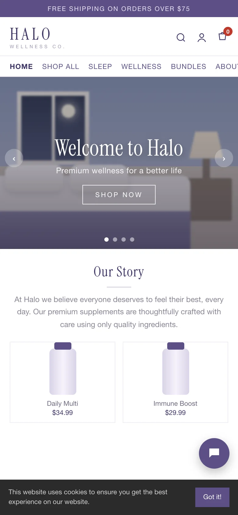
Instead it had a utility bar, a header with icons, seven menu links, a stock-photo slider with “Welcome to Halo”, an “Our Story” paragraph and a small outline “Shop now” button, with a cookie bar covering the bottom of the screen. There was no proof, no offer and nothing that said “you are in the right place”.
What I redesigned
Every change, element by element: how it was, what I changed, and why.
Headline
“Welcome to Halo” over a stock slider
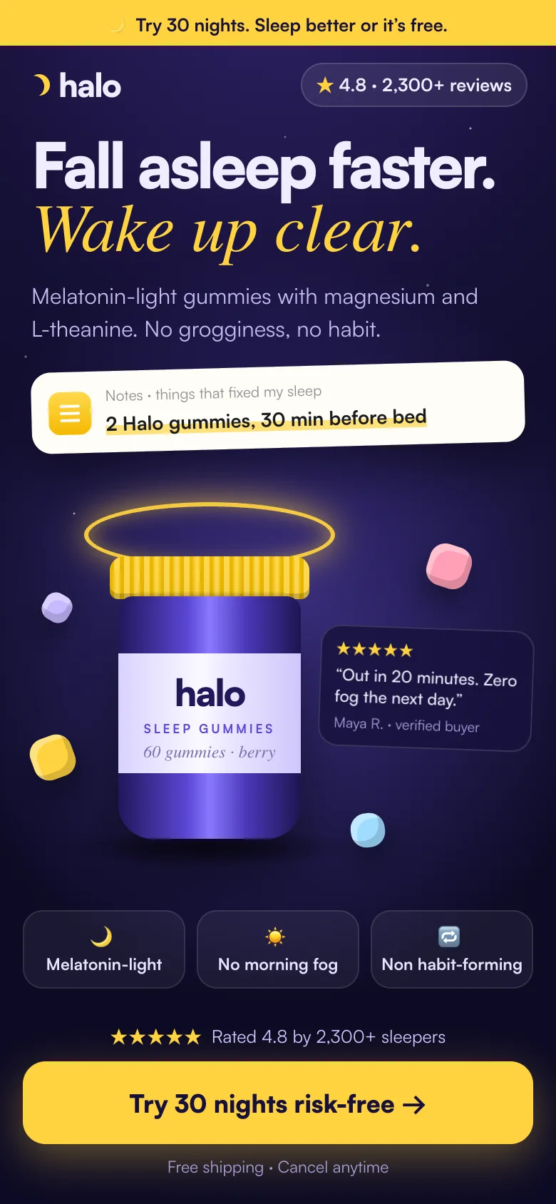
“Fall asleep faster. Wake up clear.”
Why: The ad sold an outcome. The first words on the page should repeat that outcome, not the brand name.
Ad continuity
No link to the ad people clicked
The highlighted line from the Notes ad, right under the headline
Why: Seeing the same line again confirms the click. It’s the fastest way to say “you’re in the right place”.
Navigation
Utility bar, icons and seven menu links
Logo only
Why: A landing page has one job. Every menu link is an exit before the visitor has seen the offer.
Offer
“Free shipping on orders over $75” in small grey text
“Try 30 nights. Sleep better or it’s free.” in the top bar and on the button
Why: Supplements are a trust purchase. A risk-free trial removes the biggest objection: “what if it doesn’t work for me?”
Proof
None on the first screen
Star rating and review count right above the button
Why: Proof works best where the decision happens, next to the call to action.
Objections
“Quality, Natural, Fast shipping” icons
“No morning fog, Non habit-forming, 30-night guarantee”
Why: These answer the real worries about sleep aids: grogginess and dependence. Generic claims answer nothing.
Call to action
Small outline “Shop now” below the fold
Sticky “Try 30 nights risk-free” button
Why: The button says what you get, and it stays in reach at every scroll position on a phone.
Cookie bar
Full-width bar covering the bottom of the first screen
Compact notice that doesn’t cover the button
Why: The first screen is the most valuable space on the page. It shouldn’t be spent on a banner.
Before and after
Drag the slider to compare the two versions.
Drag to compare before and after
How I’d test it
50/50 split of the traffic from the same ads, same price and offer on both pages, for at least two full weeks and until the result is significant.
- Primary metric
- Revenue per visitor (orders × average order value ÷ visitors)
- Also watch
- Add-to-cart rate
- First-screen bounce rate
- Scroll depth to the offer
- Guardrails
- Refund and cancellation rate
- Average order value
Let’s talk
Let’s make your next test a winner.
Tell me about your funnel. I’ll point out quick wins, tell you what I’d test first, and say honestly whether I’m the right fit.