

Turning a long quote form into a 3-step flow
A concept redesign of a solar quote form. The original asked for nine fields and a wall of legal text before giving anything back. I rebuilt it as a short, tap-first flow that starts with the easiest question.
The Problem
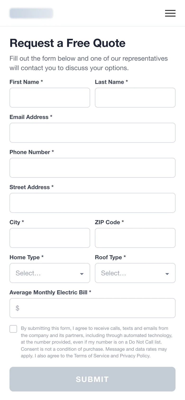
The original form asked for everything at once: name, email, phone, full address, home type, roof type and the monthly power bill, followed by a consent paragraph and a grey Submit button.
On a phone that is a wall of work before the visitor gets anything back. Every field is a reason to leave, and the hardest questions (phone number, address) come first, when trust is lowest.
What I Redesigned
Every change, element by element: how it was, what I changed, and why.
Headline
“Request a Free Quote”
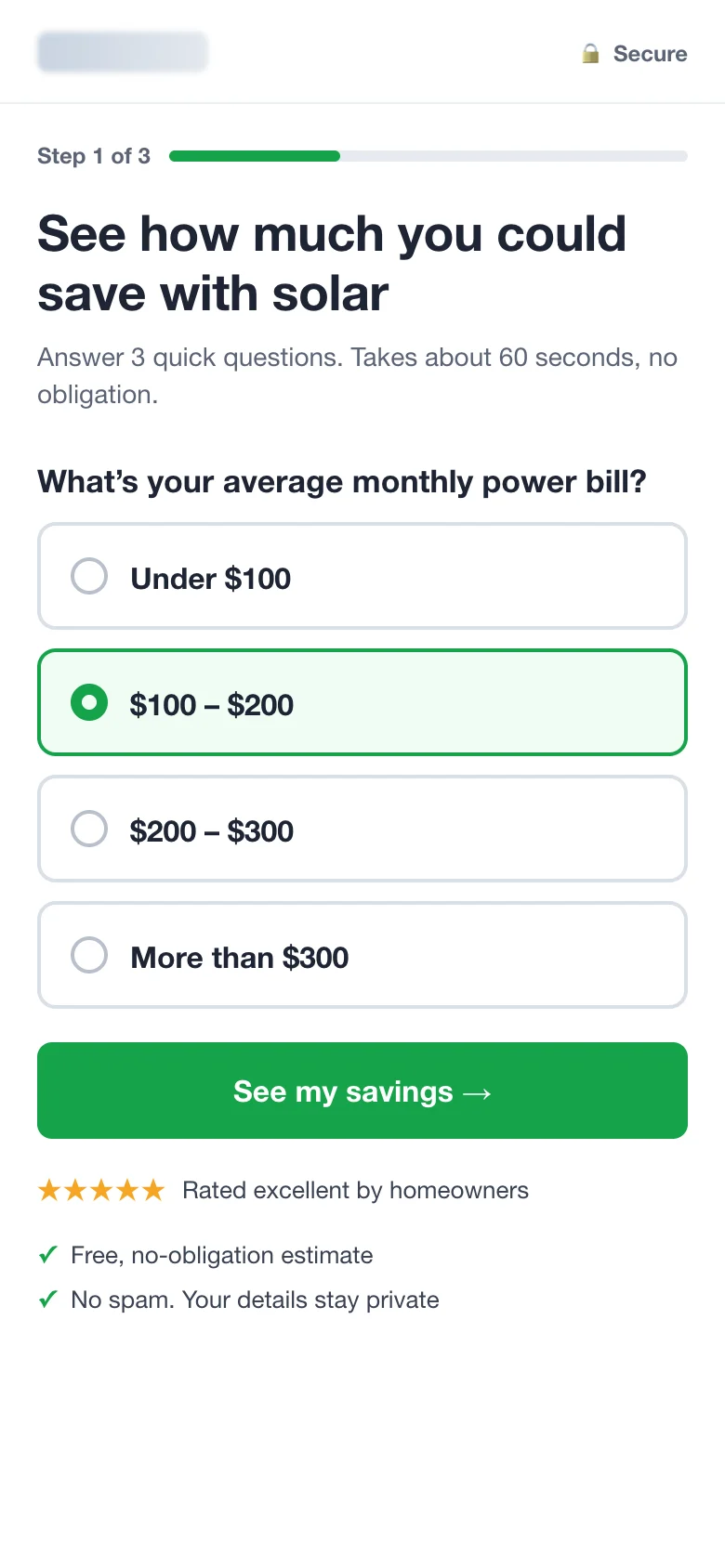
“See how much you could save with solar”
Why: People don’t want a quote, they want to know what they’ll save. Leading with the outcome gives them a reason to start.
Form length
9 fields on one screen
3 short steps, one question at a time
Why: Small steps feel easy, and every answer makes the next one more likely. Contact details move to the last step, after the visitor is invested.
First question
First and last name
Monthly power bill, picked with one tap
Why: The first question should be easy and interesting to answer. The bill is also what the savings estimate needs most.
Inputs
Free-text fields and dropdowns
Large tap targets
Why: Tapping is faster than typing on a phone, and there are no typos to fix.
Button
Grey “SUBMIT”
Green “See my savings →”
Why: The button says what you get, not what you give. The old grey one also looked disabled.
Trust
Legal paragraph above the button
Rating, “no obligation” and “no spam” near the button; consent moves to the last step
Why: Reassurance belongs where the doubt is, right before the click. The consent text is still there, just where contact details are asked.
Before and After
Drag the slider to compare the two versions.
Drag the slider to compare before and after
How I’d Test It
50/50 split on all paid traffic, step-level tracking, run for at least two full weeks and until the result is significant.
- Step 1 start rate
- Drop-off on each step
- Time to complete
- Lead quality: share of leads sales can reach
- Cost per lead
Let’s Explore How To Increase Your Conversion Rates