

A five-step checkout, rebuilt as one page
A concept redesign of a subscription brand’s mobile checkout. The original forced buyers to create an account and walked them through five pages. I rebuilt it as one page with express pay up top and guest checkout by default.
The Problem
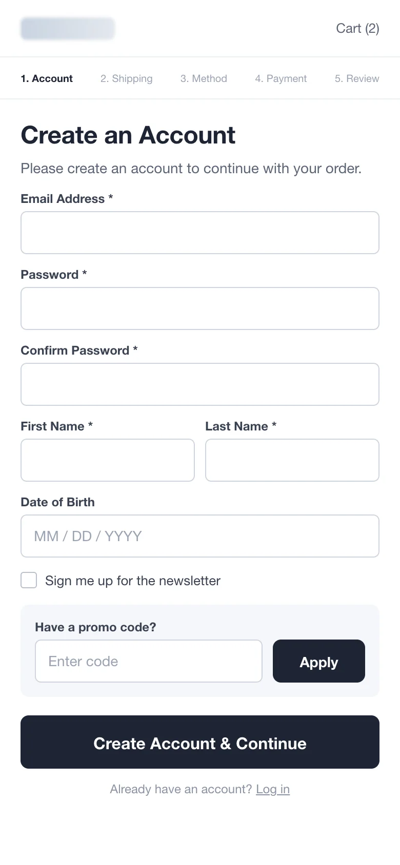
By the time someone reaches checkout, they have already decided to buy. The only job left is to not get in the way, and this checkout got in the way five times.
It started with a forced account (with a password, twice), then split shipping, shipping method, payment and review into separate pages. A big promo code box sat right above the main button, inviting people to leave and search for codes.
What I Redesigned
Every change, element by element: how it was, what I changed, and why.
Account
“Create an account to continue”
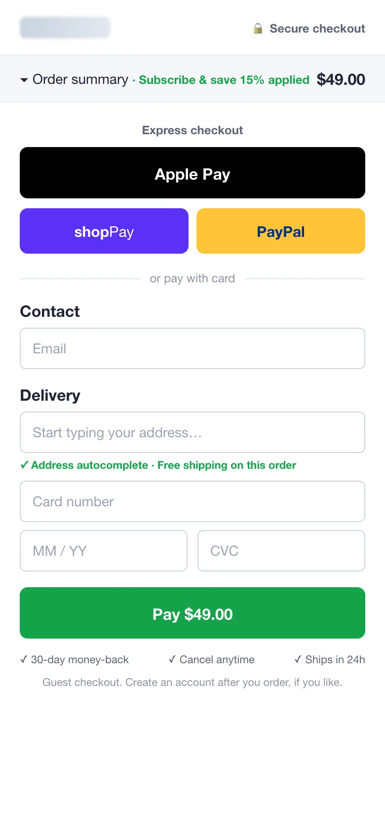
Guest checkout, with an optional account after the order
Why: Forced account creation is one of the most common reasons people abandon checkout in Baymard Institute’s research. Asking after the purchase keeps the sign-ups without blocking the sale.
Steps
Account › Shipping › Method › Payment › Review
One page
Why: Every new page is another load and another chance to leave. On one page, buyers see how little is left to do.
Express pay
Not offered
Apple Pay, Shop Pay and PayPal at the top
Why: Returning shoppers can pay in two taps with details their phone already knows.
Promo code
Large box above the main button
Collapsed link in the order summary
Why: A prominent empty code box tells people they are missing a discount, and they leave to find one.
Order summary
Hidden until the last step
Sticky summary with the total and the subscription saving
Why: People want to see what they are paying at every point. Showing the saving reinforces the decision.
Button and trust
“Create Account & Continue”
“Pay $49.00” with money-back, cancel-anytime and shipping notes
Why: The button says exactly what happens. The reassurance sits right under it, where last-second doubts show up.
Before and After
Drag the slider to compare the two versions.
Drag the slider to compare before and after
How I’d Test It
50/50 split on checkout traffic, run for at least two full weeks so weekday and weekend buyers are both covered.
- Share of orders paid with express pay
- Time from checkout start to order
- Average order value
- Subscription take rate
- Refund rate
Let’s Explore How To Increase Your Conversion Rates