

Ad-matched age selector
A Medicare benefits funnel opened with a Yes/No question that had nothing to do with the ad people just clicked. I replaced it with a one-tap age selector that continued the ad, and the variant is worth about $1M in extra revenue a year.
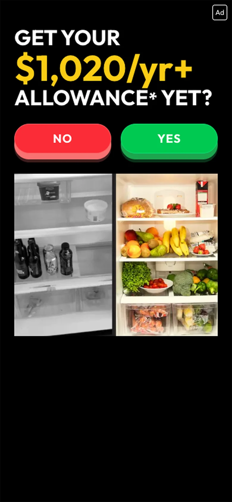

The Challenge
Paid ads were sending seniors to a quiz funnel about their Medicare allowance. The ads spoke to people by age, but the first screen of the landing page didn’t. It asked a generic “Get your allowance yet?” with Yes/No buttons, so the click felt like the start of a new conversation instead of the next step after the ad.
This is the first screen of a paid funnel. Every visitor who leaves here is ad spend lost, and even a small lift at this step carries through every step after it.
The Hypothesis
If the first tap on the page continues what the ad already said, more people will keep going.
- The ad and the landing page should feel like one story. The ads talk to specific age groups, so the page should too.
- A Yes/No question makes people stop and decide whether this is for them. Picking your age is an easy first tap with no wrong answer.
- The age tap also tells the funnel who it’s talking to, so the next steps can feel more relevant.
What I Changed
I kept the headline and the image exactly the same and changed one thing: the Yes/No buttons became three big age buttons (64–70, 71–80, 81+) under “Tap your age to learn more.” Now the first tap answers the question the ad started.
The dollar amount in the headline changes with the visitor’s location, which is why it differs between the two screenshots. It wasn’t part of the test.
Drag the slider to compare the control and the variant
The Results
The test ran for about 16 days. The variant won on the primary metric: value per session went up 8.4%, from $2.14 to $2.32. At current traffic that adds up to roughly $1M in extra revenue a year.
It wasn’t just more clicks. More people started the quiz, more of them called, and the billable call rate went up too, so the extra calls were good calls.
| Metric | Control | Variant | Relative change |
|---|---|---|---|
| Value per session Primary metric | $2.14 | $2.32 | +8.4% |
| Web conversion rate | 12.77% | 13.93% | +9.1% |
| Click-to-call rate | 31.75% | 33.63% | +5.9% |
| Billable call rate Quality check | 38.6% | 40.4% | +4.7% |
| Calls per session | 28.5% | 29.6% | +3.9% |
| Quiz start rate | 82.4% | 85.2% | +3.4% |
Test ran ~16 days. Bars show the relative change on the same 0–10% scale.

Let’s Explore How To Increase Your Conversion Rates